Sweetie
Sweetie
Sweetie is a canned alcoholic sweet tea drink.
Sweetie is a canned alcoholic sweet tea drink.
Industry
Food and Beverage
Industry
Food and Beverage
Industry
Food and Beverage
Business Unit
Branding
Business Unit
Branding
Business Unit
Branding
Team Size
1
Team Size
1
Team Size
1
Top Line Results
Top Line Results
68%
Surveyed customers stating they would recommed Sweetie to others based on its new branding.
75%
Customers reporting a stronger connection to Sweetie after rebranding.
81%
Social media followers engaging with Sweetie's content more frequently after rebranding.
The Background
The Background
The Ask
For Sweetie, an alcoholic sweet tea drink, the ask was to create a visual identity, logo design, color palette, typography, and product design for the brand.
The Ask
For Sweetie, an alcoholic sweet tea drink, the ask was to create a visual identity, logo design, color palette, typography, and product design for the brand.
The Ask
For Sweetie, an alcoholic sweet tea drink, the ask was to create a visual identity, logo design, color palette, typography, and product design for the brand.
My Approach
I was super excited to work on this brand and product form factor. The name and formulation lend themselves to a playful, approachable, and cute design. I started with research and discovery, utilizing the context supplied by the client as well as conducting my own qualitative and quantitative research, looking at market and industry trends, competitors, and target audience data. Establishing a strong brand positioning, personality, values, and messaging for the brand was key, making sure to differentiate it from an increasingly saturated alcoholic canned beverage market. Collaborating with the client, I worked off of their design brief to establish clear expectations and goals. Then the fun part: getting to work on the initial concepts for the brand identity, logo, colors, typography, and other visual elements. My approach to design is always about anchoring to the brand goals andemploying a transparent and communicative process. The tagline, “Southern Sweet Tea with a Twist.” was inspired by the desire to have a simple, clear, and catchy tagline for the brand, especially one that will catch user’s eyes quickly online or on store shelves. Ensuring clear communication about the product's essence and functionality, eliminating any ambiguity, was crucial. Equally important was conveying this message in alignment with the brand's identity, while also presenting it in a compelling and engaging manner. The phrase "with a twist" is commonly associated with alcoholic beverages, particularly cocktails, or a sense of sophistication or creativity, which aligns well with the image often associated with alcoholic beverages, especially cocktails served in upscale or trendy establishments.
The Result
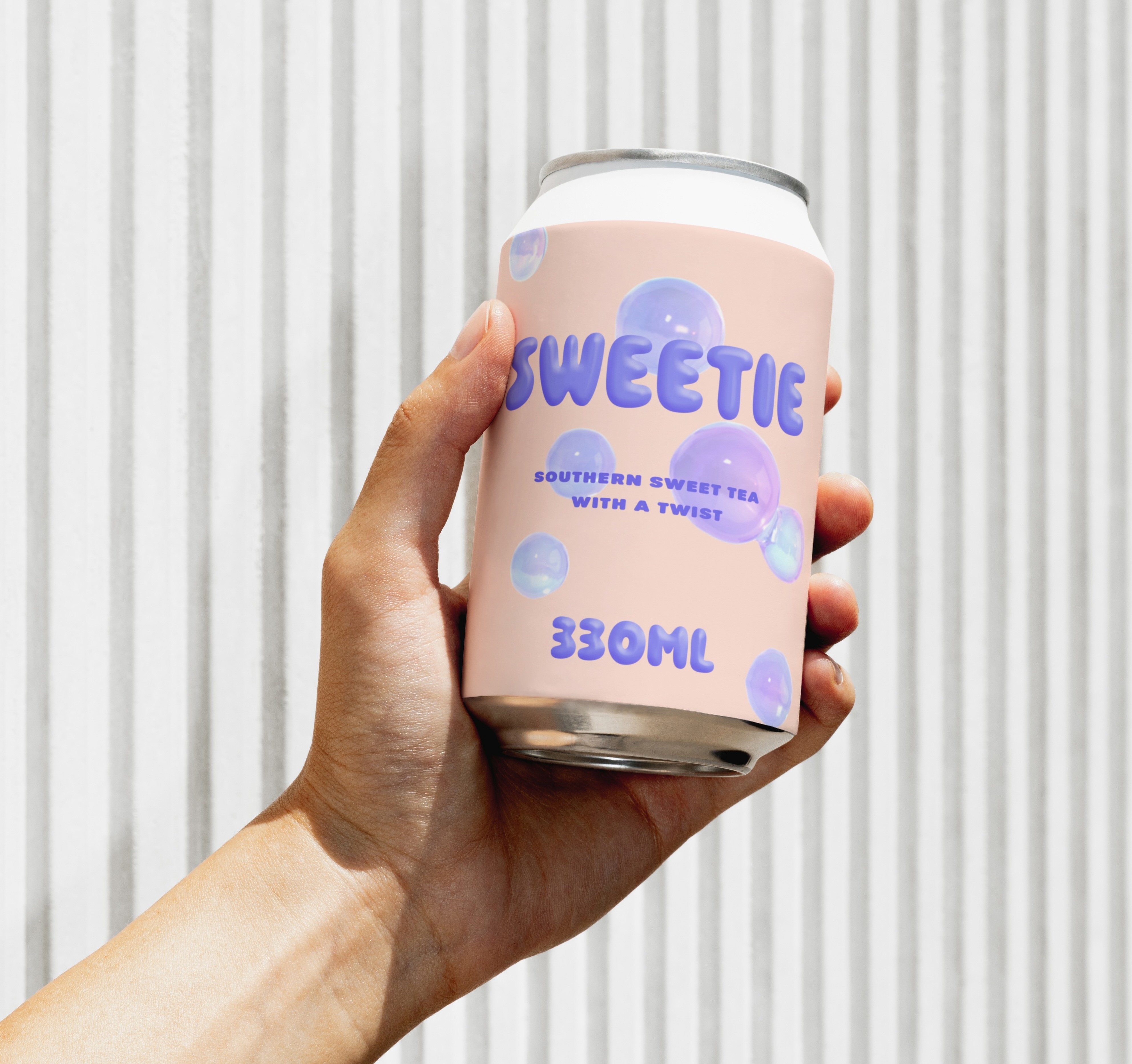
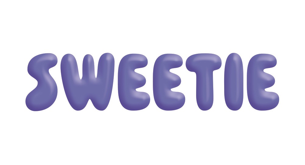
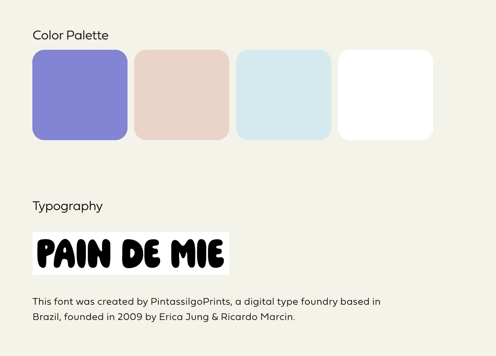
A beautiful and fun brand identity for Sweetie using a light purple as the primary brand color with light pinks, blues, and white for secondary and tertiary brand elements like the bubbles and reflections. The bubbles included in the brand’s visual identity mimic both the feel of the brand itself as well as communicate elemetns of the product in a visually-appealing way. Utilizing circles with multiple colors, shadows, and highlight effects creates this beautiful bubble. For the logo, I used a font created by PintassilgoPrints, a digital type foundry based in Brazil, founded in 2009 by Erica Jung & Ricardo Marcin, called Pain De Mie. Making the font type thicker, adding a 3D style in its effects, and modifying the kerning were all key to getting this logo right where I wanted it.
Looking for case studies?
Looking for case studies?
Some of my work is confidential so I don't display it here, but I'd be happy to share if you send me an email.
Some of my work is confidential so I don't display it here, but I'd be happy to share if you send me an email.
Some of my work is confidential so I don't display it here, but I'd be happy to share if you send me an email.


