Middle Studio
Middle Studio
Middle was a tattoo studio and café launching in New York City with a new approach to tattoo and community.
Middle was a tattoo studio and café launching in New York City with a new approach to tattoo and community.
Industry
Marketing
Industry
Marketing
Industry
Marketing
Business Unit
Branding and Design
Business Unit
Branding and Design
Business Unit
Branding and Design
Team Size
1
Team Size
1
Team Size
1
Top Line Results
Top Line Results
63%
New customers reporting that the brand's visual identity was a factor in their decision to engage.
+72%
Increase in engagement metrics on website within first 2 months.
+55%
Increase in booking rates through website.
The Background
The Background
The Ask
Create a visual identity, logo design, color palette, typography, and website for the brand.
The Ask
Create a visual identity, logo design, color palette, typography, and website for the brand.
The Ask
Create a visual identity, logo design, color palette, typography, and website for the brand.
My Approach
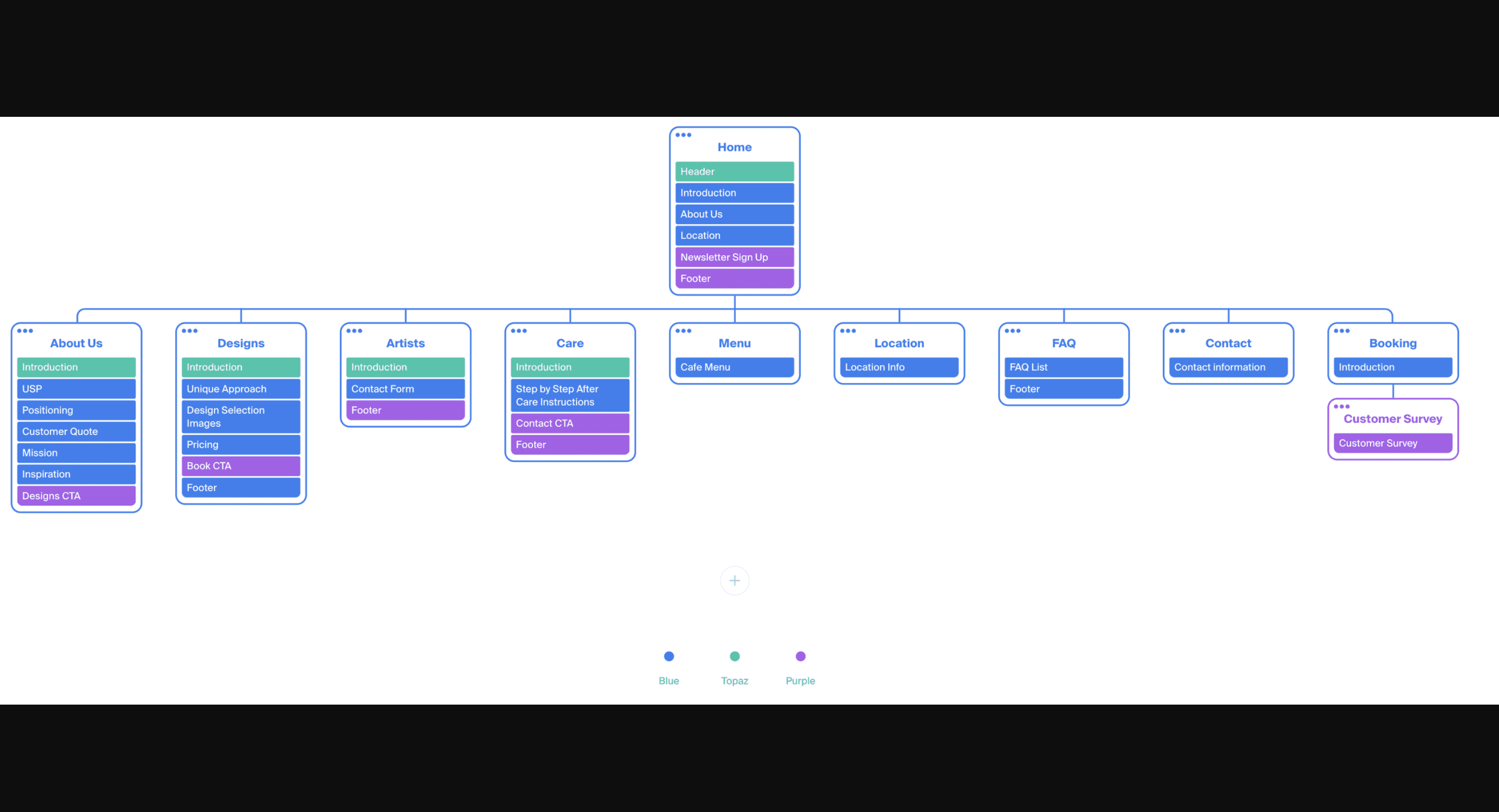
I created the brand’s website, integrating their products and services information, brick-and-mortar locations, café menus, and appointment booking functionalities. Starting from point zero, I researched and synthesized insights about the brand’s target demographic’s behaviors, psychographics, and preferences. Combined with the brand’s business and launch goals, I created a website infrastructure that streamlined the customer experience, effectively showcased the brand’s unique positioning and voice, and offered clear services for the site and mobile experience. This project also included creating the brand’s visual identity, logo, voice, color palette, positioning, content, and copy from scratch.
The Result
The result was a stunning and streamlined brand identity, marketing materials, and website that convey its nostalgic, welcoming, fun, and modern feel. The website clearly showcases the brand’s unique positioning and voice, while providing education and appointment booking capabilities to users. For the brand logo and font book, I used multiple weights of the Roc Grotesk Family. These fonts were created by Nikola Kostić and Zoran Kostić from Kostic Type Foundry.This was one of my all-time favorite projects and I’m super proud of the result.
Looking for case studies?
Looking for case studies?
Some of my work is confidential so I don't display it here, but I'd be happy to share if you send me an email.
Some of my work is confidential so I don't display it here, but I'd be happy to share if you send me an email.
Some of my work is confidential so I don't display it here, but I'd be happy to share if you send me an email.


